Posts
Posts


And formatting matters!
When calculating royalties, CreateSpace deducts from the author's share on a per-page basis. Thus, books with a lower pagecount get a considerably more in royalties, and can even charge a much lower cover price. This is a win for both self-publishing authors and for readers, not to mention saving a few more trees from early death.
While I always encourage writers, self-published or not, to write concisely, even a book without wasted words may run long. All the better, if you have an epic story that's full of nothing but the good stuff! Still, you don't want to overcharge readers no matter how good the stuff is, and after all your hard work, you'd probably like to earn a reasonable royalty per copy sold. Luckily, you can make this happen with a few simple adjustments to your formatting.
Less fortunately, a good number of self-published writers, and even some small presses, fail to make wise formatting adjustments. After encountering one novel too many with tragically wasted pages, wasted space, and a cover price way too low for the author to make much with (especially if it's distributed outside of the CreateSpace store, where royalties start shrinking rapidly), I've decided to share my modest wisdom. While hardly an expert, in the example that follows I do manage to cut a book's pagecount by more than half without trimming a word. Then I go on to trim a few words, because I can always do better.
I figure a good starting point is a complete novel of around 100,000 words. Happily, I just so happen to have one of those lying around. One Hundred Days is still undergoing revisions, but the first draft is 98,448 words long and 208 pages--as a Microsoft Word document, at least.
Some people might be willing to print their book in 8.5" x 11", but I am not one of them. I want my book to look like a book--in fact, grasping a model at random off my shelf, I find a nice, solid mass market paperback of 5 by 8 inches. And CreateSpace has an option for books in just that dimension! Excellent!
Under the "Page Layout" tab, just to the right of margin settings in MS Word 2010, you'll find the "Size" option. Select "More Paper Sizes" and set your preferences in the window for custom settings.
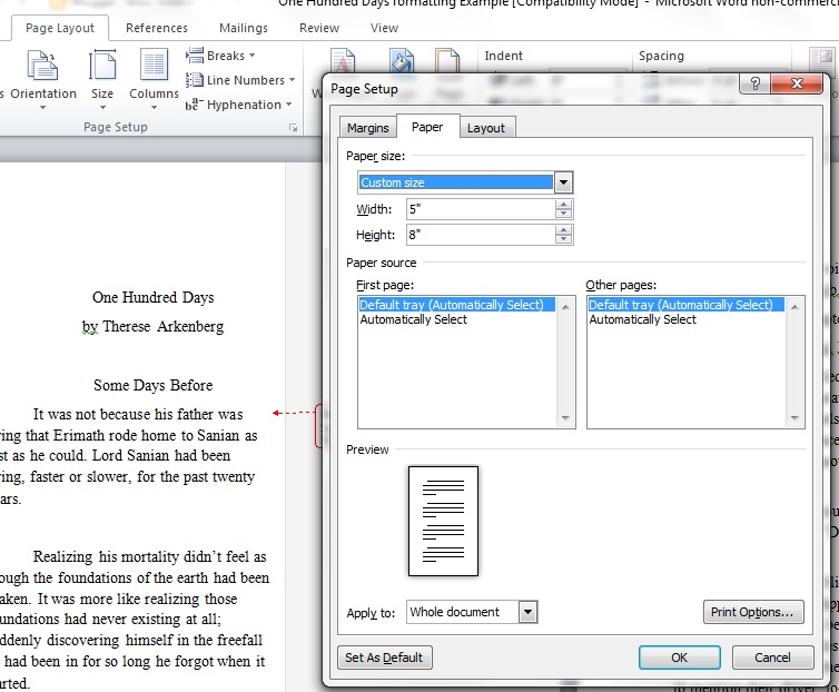
Width, five inches, and Height, eight inches, and--
Oh.
My slim 208-page baby is now a whopping opus at 634 pages. I feel like Tad Williams. That's good, though, right? Everybody loves long fantasy novels! Look at George R.R. Martin!
Now, my loyal readers deserve a good price, so I'm going to charge $9.99. Plugging this into the CreateSpace royalty calculator (through the link under the Royalties tab), I see that with each sale I will make:

Negative two and a half bucks for each sale on Amazon (on the bright side, it's just less than negative fifty cents through CreateSpace). Clearly if I'm not going to lose money, I'll have to ask more. $11.99... still negative...$12.99 doesn't do it either...skipping over unlucky number 13, I find a cover price of $14.99 will net me a full 50 cents on Amazon. But I'd have to charge $21.99 to make anything off expanded distribution. This is, remember, is for a mass market-style paperback, the kind that retails at the drugstore for $6.99.
It looks ugly, too:

Here's the first fix, and it's relatively painless: increase the page size from 5x8 to 5.5x8.5. This makes it "trade" paperback sized, while not weirdly large (in fact some trade paperbacks are 6" x 9", and this may be a good option if you really want to slim down). Furthermore, increasing your page size does not affect price. This makes CreateSpace a weird inverse of the offset printing world, where mass market paperbacks are cheaper than trade. If you've got your heart set on a mass market paperback size, you can keep it, just use the other tips here, and realize it'll still come out more expensive than other books of the same size.
By making our pages bigger we've cut the number of them down to 517.

And now, at $9.99 cover price, we're able to make a profit of just under one dollar in the CreateSpace store! But we're still losing a dollar a sale on Amazon.
My next suggestion is to drop the font size. I wrote One Hundred Days in Times New Roman, size 12, which is the easiest for me to read onscreen. Not everyone finds Times New Roman optimal for POD printing, but I suggest you stick with a similar serif font such as Garamond. 12 point font is actually rather large, though, and you're better off dropping it to 11 points or even 10. If you're unsure whether you're going too small, try a 'print test'--format a page, print it out, and see if it's readable. 11 point font is 11 point font; if it's readable on a sheet of printed paper it'll be readable on the page of a printed book.
As an aside, if you want your books marketed as Large Print, they need to be in at least 16 point font. I'd suggest you format a complete separate edition, likely with a higher cover price, if you're really dedicated to ease-of-use for your nearsighted fans (even as this nearsighted fan thanks you).
At 444 pages, you're able to make nearly $2 in royalties through the CreateSpace Store. But still no revenue from Amazon, and the pages still look slightly off:

This is because I wasn't careful when I switched from manuscript formatting to publication formatting. Line spacing is at 1.15, and there are 6 extra points between paragraphs. Although some experts suggest having line spacing slightly greater than 1, there's no need for any extra space between paragraphs, especially given how I'm using first-line indents.
Some experts who want greater-than-one spacing suggest setting a point width exactly, and making it several points greater than the size of your font. If you're confused right now because you don't know what a point is, don't be: I don't know what a point is either, except it's some sort of measurement of the height of letters and/or lines. 12 point font is bigger than 11 point font, and setting spaces of 'exactly' 13 points between rows of 11 point font should give me enough space to satisfy anyone, without leaving unsightly gaps:

This all goes on in the 'paragraph' window, as you can see. Spacing before and after should be zero. Note the "Special" indentation but don't worry about it just yet.
My file for One Hundred Days is now 352 pages long. That's considerably shorter than it started out as, and would net me 92 cents royalty on each Amazon sale. I'm very nearly satisfied.
Some self-publishers are satisfied at this point. But be wary. It's a trap. This is the mistake which drove me to write this post in the first place.

Don't those margins look a little off to you? They're so wide, the text is like a column across the middle of the page. And that pure, snow-white inch on each side--that's wasted space.
You correct margin formatting under "Page Layout". Select Custom Margins, and then look down at the "Multiple Pages" options. You'll want Mirror Margins, differentiated by "inside" (the spine) and "outside" rather than Left/Right. Because of the book's binding, CreateSpace suggests having at least .75" of inside margins. But this is still a good quarter-inch less than the default one-inch margins give you. And you certainly don't need, or want, one-inch margins everywhere around the page!

My favored setup is .8" for the inside (I'm cautious), and .5" or less for the top, bottom, and outside. This still gives readers a place to stick their thumbs--the purpose for an outside margin--if not to take notes (I figure they can use post-it notes if it's vital) and allows another inch of text on every page.
Making this change saves me nearly one hundred pages--from 352 to 258. At $9.99, the book now earns $2.05 in each Amazon sale, $4.05 from CreateSpace, and...wait for it...5 cents with each sale through expanded distribution.
Hey, at least it isn't losing money.
Reducing the margins is probably the single best thing you can do to save pages, and it makes your book look much more professional. Another change that should be made for professionalism, even if it doesn't save a lot of space, is adjusting your paragraph indents. That should be the First line indent option under the Paragraph screen--do not indent using tabs!
Instead of the default half-inch indent, which looks really deep and distracting (and even worse if you have wide margins), I would suggest 0.3". You might even try 0.2" for smaller pages or finer-grained fonts, but 3 is a nice round number.
This adjustment is primarily aesthetic, but it drops the page count from 258 to 254--and 4 fewer pages nets me an extra nickle per copy sold, with a royalty of $2.10 at Amazon and a whole $0.10 in expanded distribution. At this point I begin to realize there's not a lot of money in expanded distribution, and that only makes me sadder for writers who don't format in a way that lets them make the best of what they've got.
Now the formatting is mostly complete, but you may make a few more adjustments. Read through your book to see if anything more can be trimmed. Remember, wasted space is wasted money! Consider cutting your transition page and just write 10 years and a Musical Interlude Later above the next chapter. Your dedication will look fine on your copyright page, and you probably don't need 3 introductory pages of reviewer quotes however much the reviewers love you. I wouldn't make a blanket rule against page breaks for new chapters, but do watch around those page breaks, as well as final pages, for any dangling lines or paragraphs. See below:

If you don't want to cut dangling lines or paragraphs, you can instead expand on them, adding enough vivid and juicy details to make them worth the space.
My final result: 98,00 words in 249 pages.
Royalty for 9.99 paperback: $2.14 on Amazon, $4.14 in the CreateSpace store, and $0.14 through expanded distribution. I'm not so sure that last will pay off. Of course, a near-100,000 word novel might sell for more than $10, enough to make Expanded Distribution worth it.
As a gift to a friend, I once printed a book of slightly more than 100,000 words in 5.5"x8.5" dimensions, and it came out at 349 pages. This is because there were more chapter breaks, and since I was writing for fun I allowed more "dangling lines," and most crucially, I wasn't thinking and I left the font at 12 pts. But the fact is, based on your preferences your 100,000 page book might indeed come out closer to 350 pages than 250. It wouldn't bring in much at $9.99, but at $12.99--still quite reasonable now that most paperbacks go for $15-$16 at retail--it would bring in $2.74 at Amazon, $5.34 at the eStore, and $0.14 expanded distribution. The sense I'm getting is that expanded distribution is just difficult. But I could create a steep discount code for the CreateSpace store and still make a profit!
One last word of advice for slimmer books: CreateSpace has a fixed price for books 108 pages and lower. This is not the case with Lulu, which has no floor--if you can fit your story onto 60 pages it'll be cheaper than 65 pages, and so on. But if you're with CreateSpace, you won't get any better deal for cramming into 75 pages what would look better in 95. Cramped pages with tiny margins and tiny font are a pain, and look doubly ridiculous if the book itself is slender. Also, books need to be at least 100 pages before you can add a title and author's name onto the spine, because a certain width is needed to provide a margin of error for printing. CreateSpace suggests not adding spine text to books of less than 131 pages, and LighteningSource's minimum is 80 pages. You decide what risk you're comfortable with (I have seen 100-page POD books with perfect spine text). For very thin books, you might also consider printing on "cream" paper, which is a bit thicker than white and may round out a book that would otherwise appear anemic.
To conclude, my inner economist wants to crack a joke about proper formatting being all about the marginal difference--but I won't. Instead, I shall just wish you good luck with your next publishing endeavor, and I beseech you to remember the margins. Your bank account, your readers, and the trees will thank you!
For more tips on formatting for people who are writers, not designers, see my post on Promotional Bookmarks through VistaPrint. And for more advice on formatting, publishing, and writing in general...well, I've literally written the book on writing, editing, and publishing. And formatted it for CreateSpace, fitting 97,000 words onto an extremely readable 200 pages. Not to brag or anything.